


08.15.2023
The Influence of Room Color on Mood:
Exploring the Connection
COLOR PSYCHOLOGY FOR A TIMELESS DESIGN
By Heather Bien
How do you feel when you take a seat in a dark navy library? Or what about when you pull up a chair in a red dining room? Can you imagine the calm of lounging in a living room filled with creams and neutrals?
Colors aren’t just chosen for their aesthetic appearance, particularly when chosen by an interior designer with a deep understanding of color psychology. Dana Feagles of Revelry Interior Design says, “The psychology behind color is nuanced and interior designers take full educational courses on the subject.” Colors have the ability to totally change how you respond to a room. There’s power in a sunny yellow or a subtle green to impact your mood and to tell your mind and body how they should feel in a space.
Recognizing these reactions to color and using them to your advantage while styling your bedroom, kitchen, living room, or home office can elevate your design and help you create a space you’re happy to come home to. Here’s how four design experts have done this in their own homes and for clients.
There’s power in a sunny yellow or a subtle green to impact your mood and to tell your mind and body how they should feel in a space.

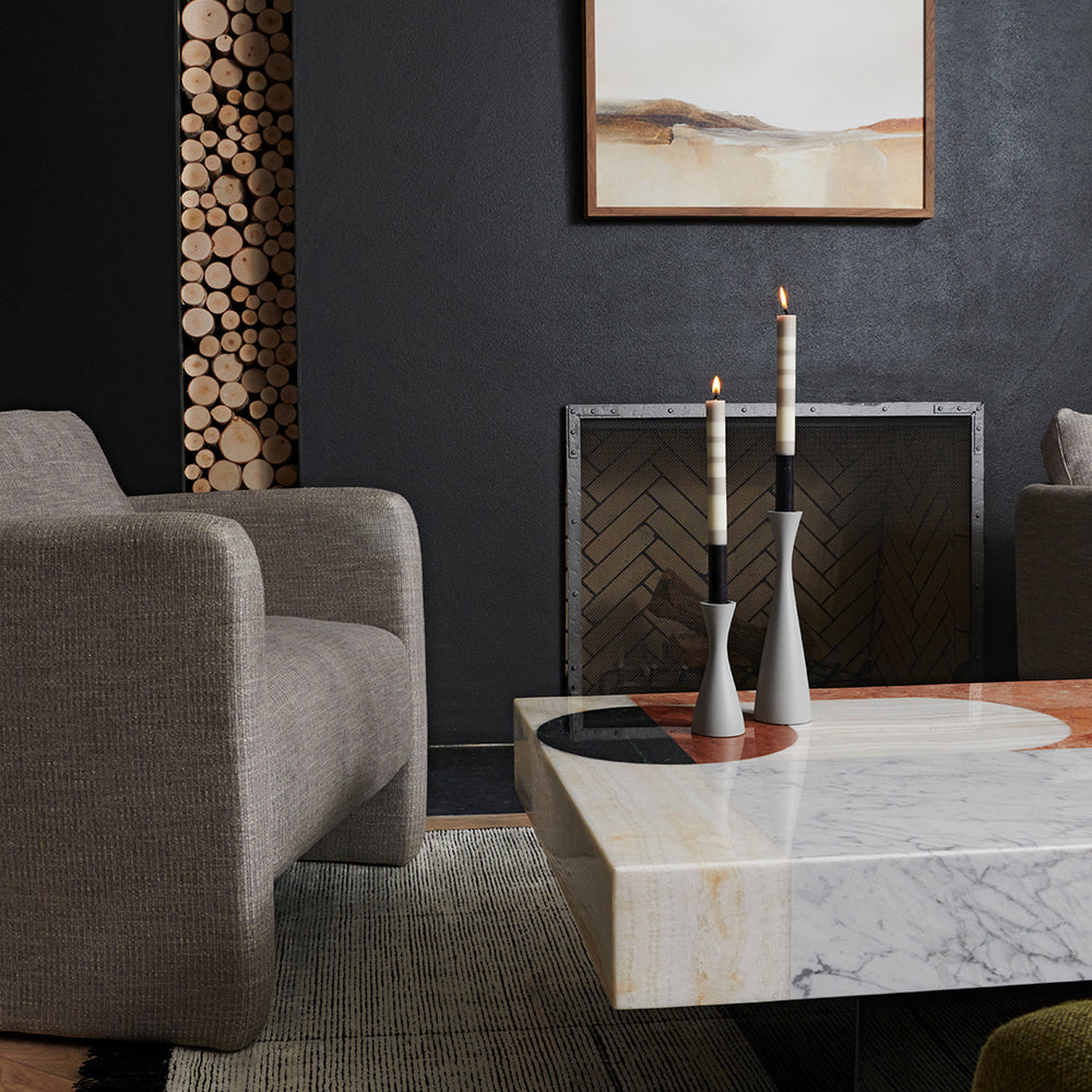
Embrace Dark Colors for Relaxation
While dark colors aren’t often our first instinct for bedrooms, interior designer Liz Lipkin has found they can create a relaxing, enclosed cocoon, ideal for sleep.
Lipkin says, “I recently completed a project where we had the primary bedroom painted Benjamin Moore Buckhorn, a dark brown, and the office /guest room painted Benjamin Moore Graphite, an almost black gray.” She continues, “Two otherwise ordinary rooms were completely transformed by dark colors into cozy, enveloping spaces. This is an especially nice effect in a bedroom where you want to set a relaxed mood that's conducive to rest and sleep.” She reports that in her own home, she color-washed the entire bedroom—walls, doors, trim—in velvety, moody Benjamin Moore Kendall Charcoal. “I swear I sleep better because of it,” says Lipkin. It’s like being wrapped up in a blanket of color.

Choose the Right Yellow for Energy
Yellow can be tricky, but in the right shade, it can create an energetic, happy space. Artem Kropovinsky, interior designer and founder of Arsight, has seen that firsthand when he painted a room bright yellow. It looked bold and striking at the start. But, as the clients moved in and began to live in the space, they found it had too much energy.
“The clients reported feeling uneasy and tense within the space. I realized the color was overly stimulating and repainted the room in a milder yellow, which the clients found much more pleasing,” says Kropovinsky. With yellow, go bright, but dial it back just a bit to strike the right tone.

Use Light Earth Tones to Create Calm
May Leung of MAOR designed a stunning modern home nestled in the mountains of upstate New York. With striking concrete, steel, and glass, the home is an architectural work of art. But its minimalist materials and abundance of glass windows could have leaned heavily into a cold, over-exposed feeling. To counteract that and, instead, introduce a cozy mood, Leung used a warmer linen neutral on the walls, rather than a crisp white.
Leung says, “We chose plaster walls in a linen colorway to create a warm and earthy feel that balances the modern architectural style of our home.” This organic color feels familiar to the human experience—it’s straight from the earth. That connection introduces a feeling of calm that washes over you when you walk in. “It complements the visual beauty of the natural environment outside,” adds Leung.


Set the Mood for Entertaining with Red
Red has been a classic dining room color for centuries, and for good reason. It’s a passionate, stimulating color that sparks an appetite both for food and conversation. Red is perfect for entertaining spaces, including kitchens, because it can give a room a lively energy, encouraging people to come together.
However, avoid using red in bedrooms, living rooms, or anywhere that you’d prefer to invite a more calming atmosphere.
Evoke Serenity with Sage Green
Feagles had a client adding a home office, which became known as the ‘Zoom Room.’ She explains that the client wanted this space to bridge professionalism, serenity, and personality—which are often seen as at odds with each other. “Sage green was the perfect solution. I used Farrow & Ball's Card Room Green on her Zoom background, which included custom arched built-ins designed in a classical style,” says Feagles. She notes that because sage green is a muted shade found in nature, it lends itself to a calm, serene mood, without venturing into the blues we often associate with spa spaces.
There’s a reason green rooms are green, and this is it. It’s a color that can be taken seriously, while also evoking a sense of groundedness.

Create a Tranquil Space with Blue
While Feagles avoided blue in an office because it was too tranquil, it’s exactly what you may want in a bedroom or bathroom. Soft shades of blue remind us of the sky and ocean, instantly transporting our senses to somewhere we feel relaxed.
Kropovinsky says, “I opted for a gentle blue for the walls in a serene bedroom, complemented by white accents and the addition of plants, which fostered a natural, peaceful vibe. The client was delighted with the outcome, finding it an ideal sanctuary for unwinding after a long day.”